I led the design, from discovery to delivery, of a bill payment solution integrated into our existing gateway platform. This initiative, executed with a cross-functional team, reduced churn by 12% within 90 days of launch.

Context
Pagar.me started as a reliable payment gateway for online sellers in Brazil. As the business grew, the goal shifted:
from just processing payments to offering a full suite of financial and banking tools and becoming an essential part of a merchant’s daily operations.
Opportunity
Our user research showed merchants preferred handling all financial tasks in one place.
But Pagar.me didn’t yet support key daily workflows like paying bills pushing them to competitors and increasing churn risk.
Hypothesis
If we add a bill-payment feature inside the existing dashboard, merchants will keep their entire financial routine on Pagar.me, lowering operational costs for them and reducing churn for us.
Approach
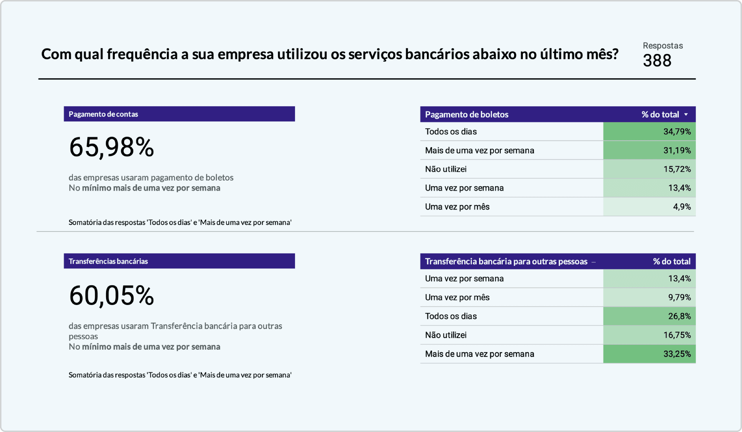
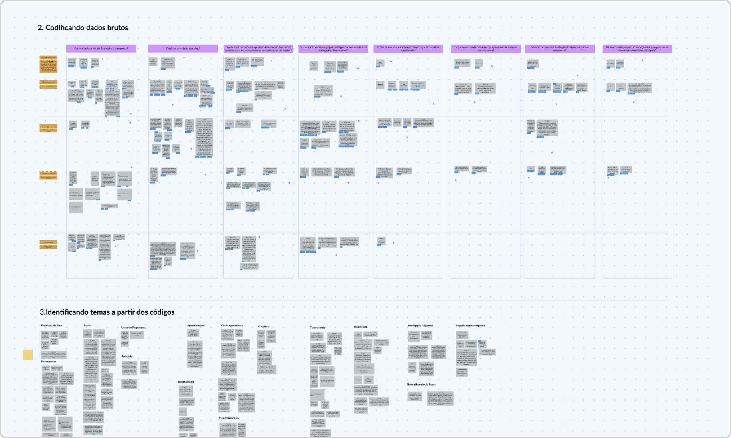
Facing many open questions, I led qualitative and quantitative research to understand online sellers' core banking needs, their alternative solutions, frictions, and most-used financial management services.
Benchmarking
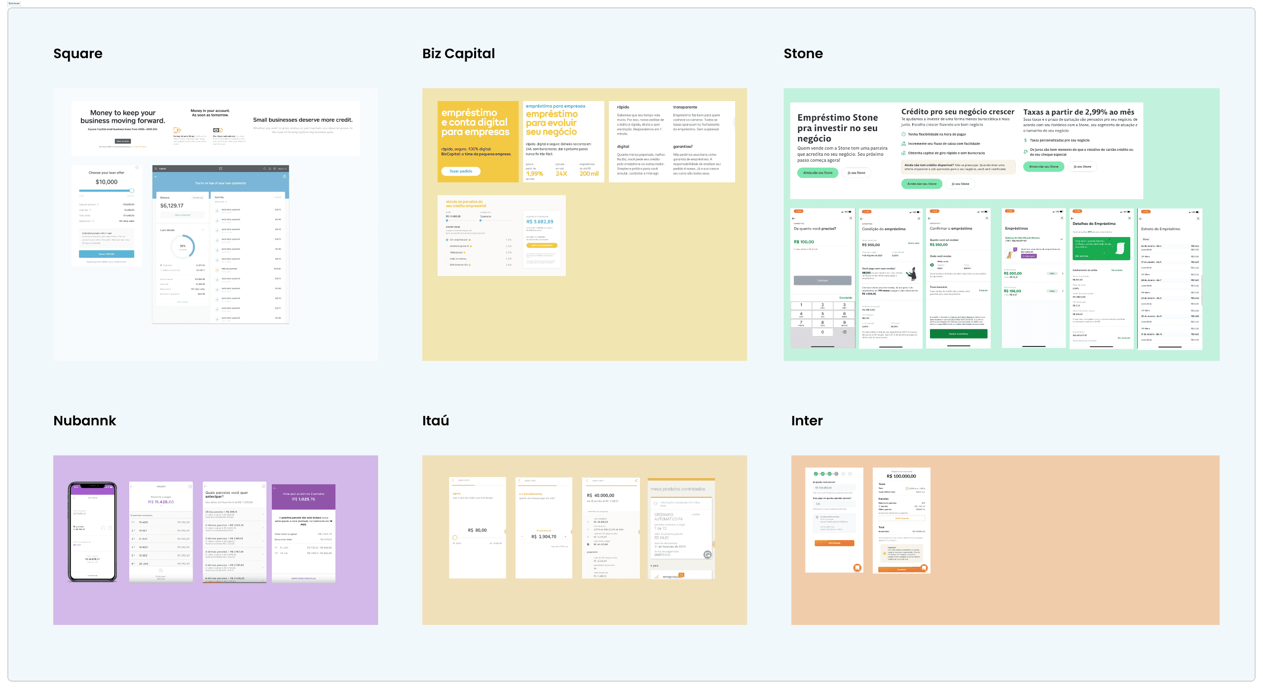
I analyzed and documented the bill payment experiences of several financial institutions to learn their strengths and weaknesses.
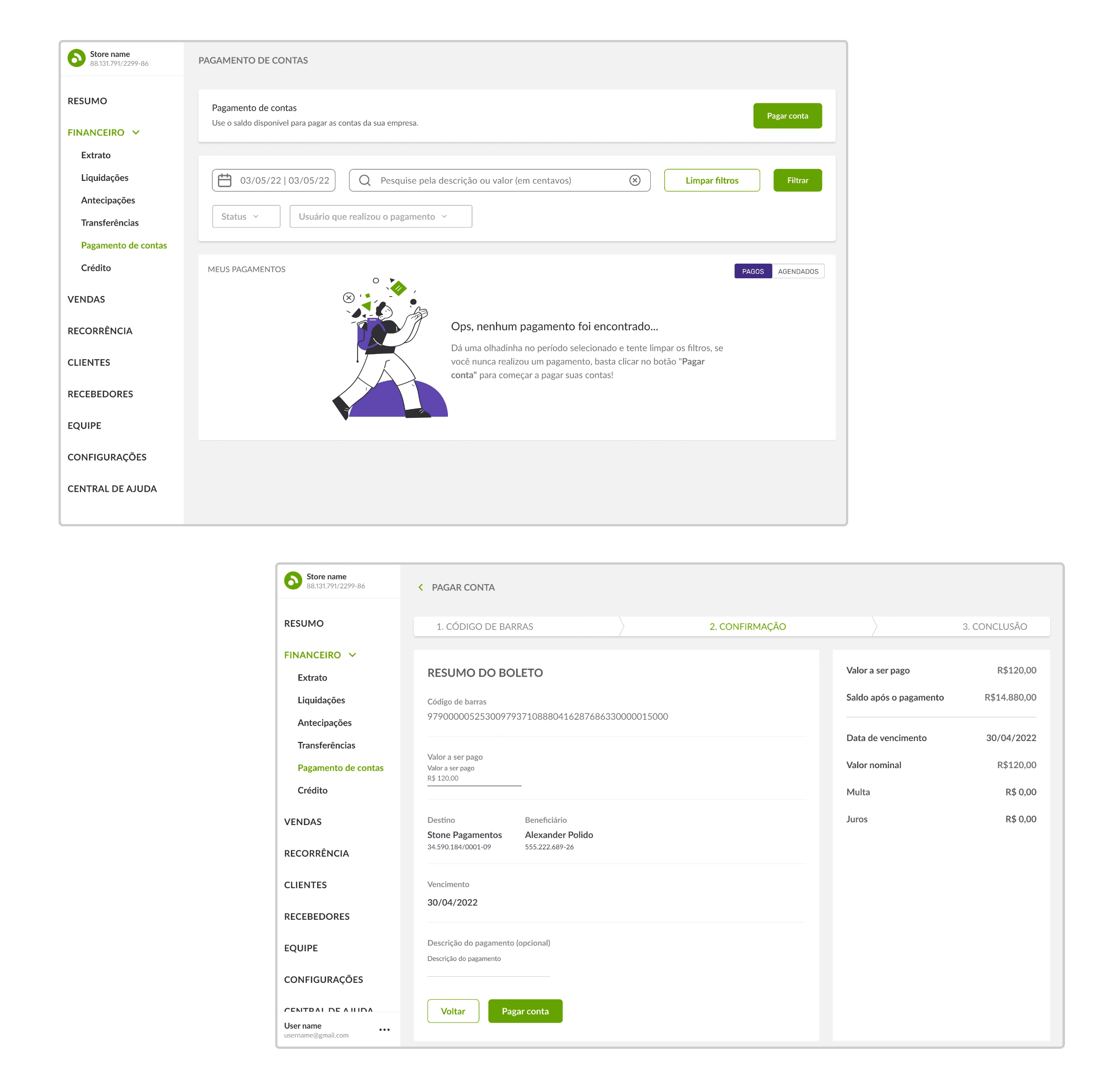
First iterations and user testing
After learning the main use cases I started to brainstorm a few solutions and get feedback from the team. After a few iterations I decided to test my solutions with real users
Key findings from usability testing
Major points that stood out from the test sessions
Outcome
By streamlining the payment process with an intuitive interface and user-friendly features, the app made bill management more convenient and accessible.

With a centralized experience and secure payment options, users could have an easier finance management routine with accurate reports and fewer interbank transfers. As a result, users experienced greater ease and efficiency, leading to higher retention rates.
