If you're in a rush, here’s a summary 👇🏽
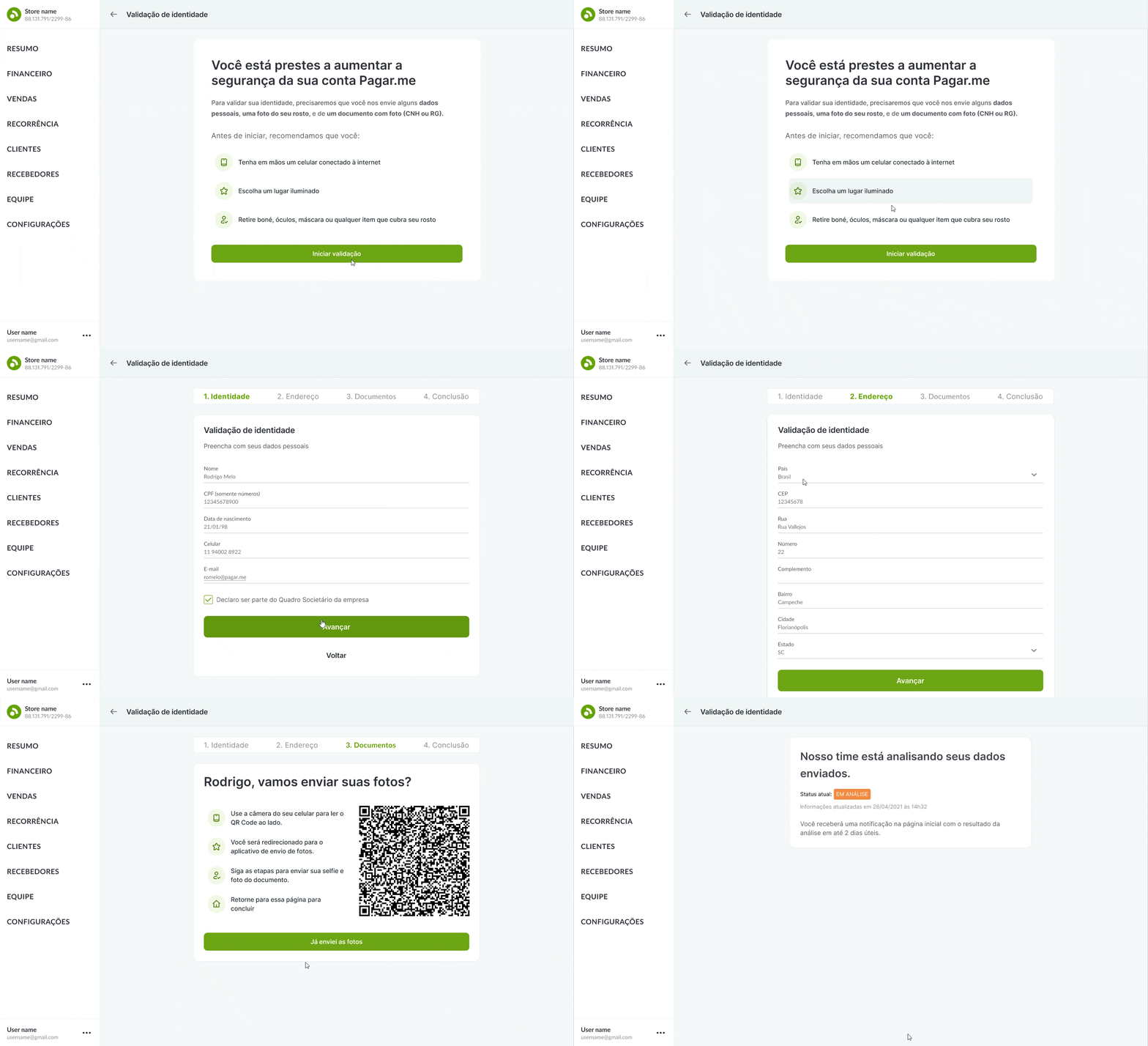
I collaborated with PM, devs and risk to design a multichannel identity check feature that verified 2800+ ecommerce merchant, helping to reduce fraud and money laundering

Context
Pagar.me aimed to become a complete financial services platform for businesses and offer a complete banking experience on top of the existing payments solution.
Problem
In order to comply with Brazilian regulations and increase fraud prevention, the company needed to verify their customers' identities via background check, document verification and facial biometrics.
Approach
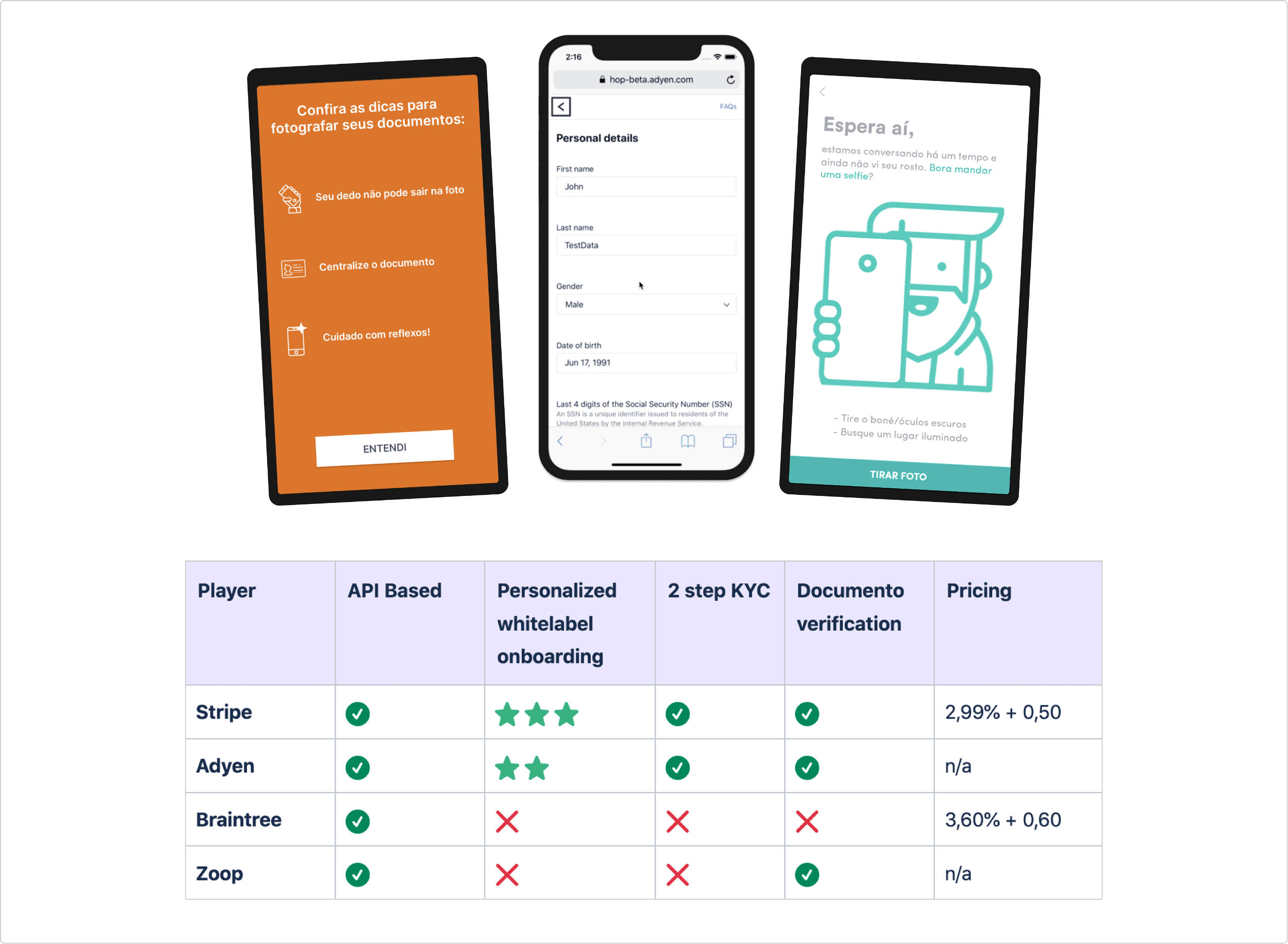
My first stages in this assignment involved developing a comprehensive understanding of the topic, creating objectives, and recognizing limitations.
User interface and prototype

Post - launch improvements
After three months from the first launch , I conducted a thorough quantitative and qualitative analysis on the live experience such as a
- Funnel analysis
- Heatmaps
- Watch user session recordingsin order to identitfy improvements.
What I learned
The personal data page is where the majority of users leave with a 79% dropout rate
Problem hypothesis
The identity check pop-up is text-heavy and has a friendly tone of voice, which led users to just close it and leave the page without actually grasping its importance.
Action
Explore ways of enhancing the visual hierarchy and text effectiveness of the pop up
Ideation
From the problem framed, I collaborated with designes to ideate on solutions

Out of the solutions, we converged to one solution that we all felt confident to test.
🗨️ The underlying assumption I wanted to test
Does a straightforward and visually appealing pop-up increase users' awareness of the ID verification and translate into fewer drop-offs?
AB testing
Besides the text and visual changes stated above, I also brought the most important instructions from the existing contextualization page to the new modal.
Therefore, I decided to redirect users that clicked the modal straight to the first form page.

Expected result
I expected to increase the percentage of users who get to the Address Page from 15.9% to 17.49% in 2 weeks
Outcome
Primary metric: Address Page reach
The percentage of users who reached the address page increased by 357% (from 14,47% to 66,25%).

Secondary metric: CTR of the new pop up
The click through rate of the pop increased bt 144.26% from 6% to 16¨%

This increase in conversion rate contributed to an overall increase in verified users. A total of 2800+ merchants successfully verified their identities, with only 13 support cases being opened.

