The one where I redesigned a barbershop booking app to increase bookings

The one where I redesigned a barbershop booking app to increase bookings

If you're in a rush, here’s a summary 👇🏽

If you're in a rush, here’s a summary 👇🏽

Top Salão is one of the top three barbershop booking mobile apps in Brazil, with over 100k downloads and a 4.6 overall rating.
I was hired to redesign the appointment booking journey with the goal of enhancing the user experience and increasing the number of bookings.

Top Salão is one of the top three barbershop booking mobile apps in Brazil, with over 100k downloads and a 4.6 overall rating.
I was hired to redesign the appointment booking journey with the goal of enhancing the user experience and increasing the number of bookings.

Problem

Through user research, I discovered that the app had a few usability problems.
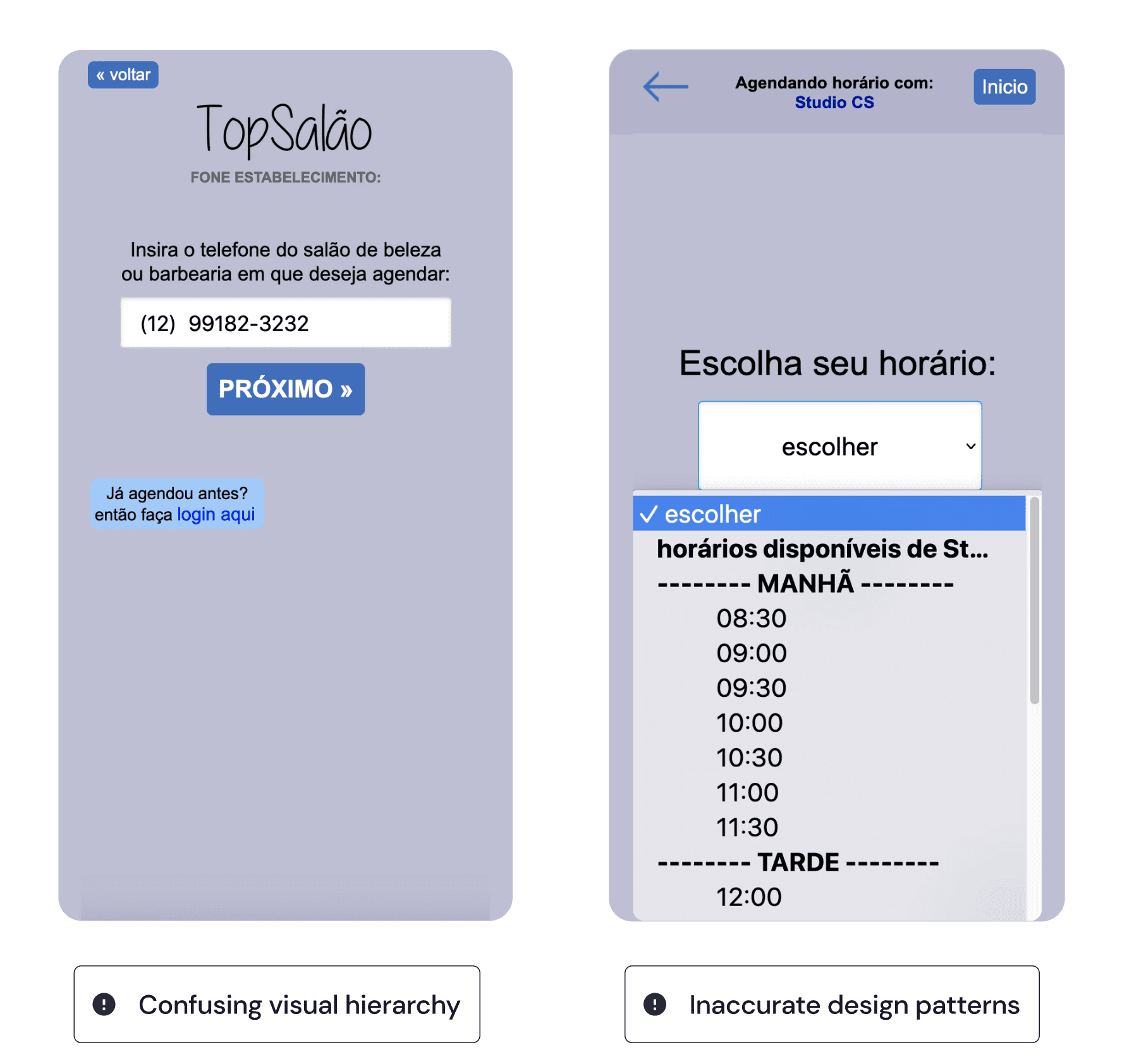
Users found it difficult to navigate through the app and book appointments

Users found it difficult to navigate through the app and book appointments

Users found it difficult to navigate through the app and book appointments

There was no clear visual hierarchy, and users had a hard time finding important information.

There was no clear visual hierarchy, and users had a hard time finding important information.

There was no clear visual hierarchy, and users had a hard time finding important information.

The color palette was not visually appealing and the app’s design looked outdated.

The color palette was not visually appealing and the app’s design looked outdated.

The color palette was not visually appealing and the app’s design looked outdated.

Approach

After identifying the main gaps in UX, I designed a high-level tree of improvement opportunities to guide my decisions.

Then, in order to gain knowledge and inspiration, I went on to conduct some benchmarking with related apps.

Finally I started to do some sketching to materialize my approach and get early feedback from the client

Benchmarking
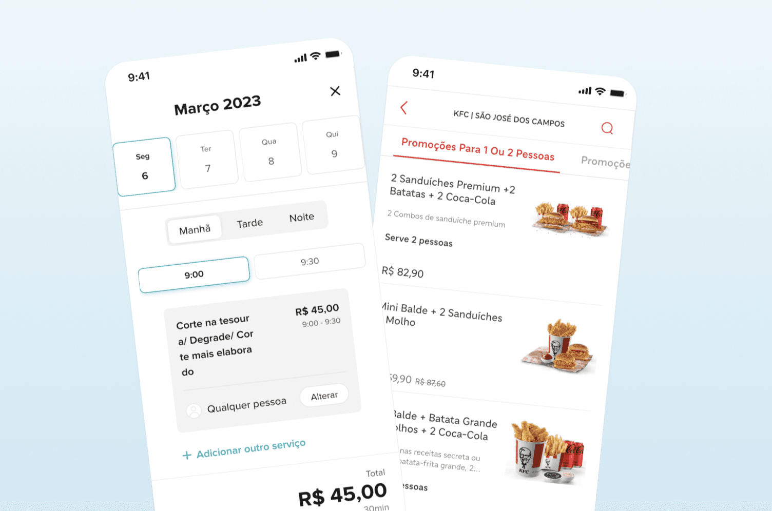
After a round of feedbacks and iterations, I progressed to build the style guide and do high fidelity prototype

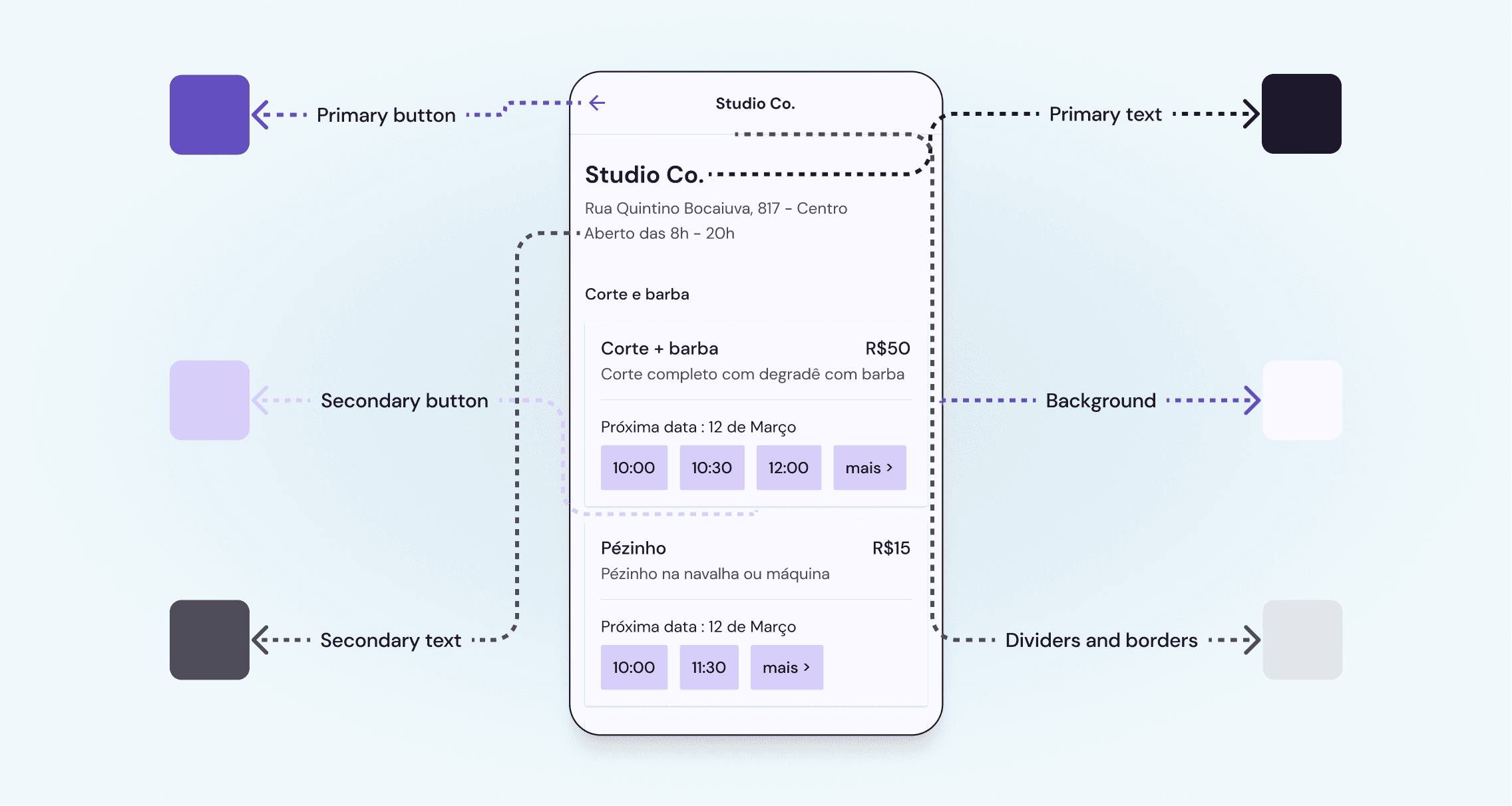
Choosing the colors
Final solution

My primary focus was on improving the app's usability and visual appeal. To achieve this, I simplified the design, making navigation more intuitive for users to find what they need.
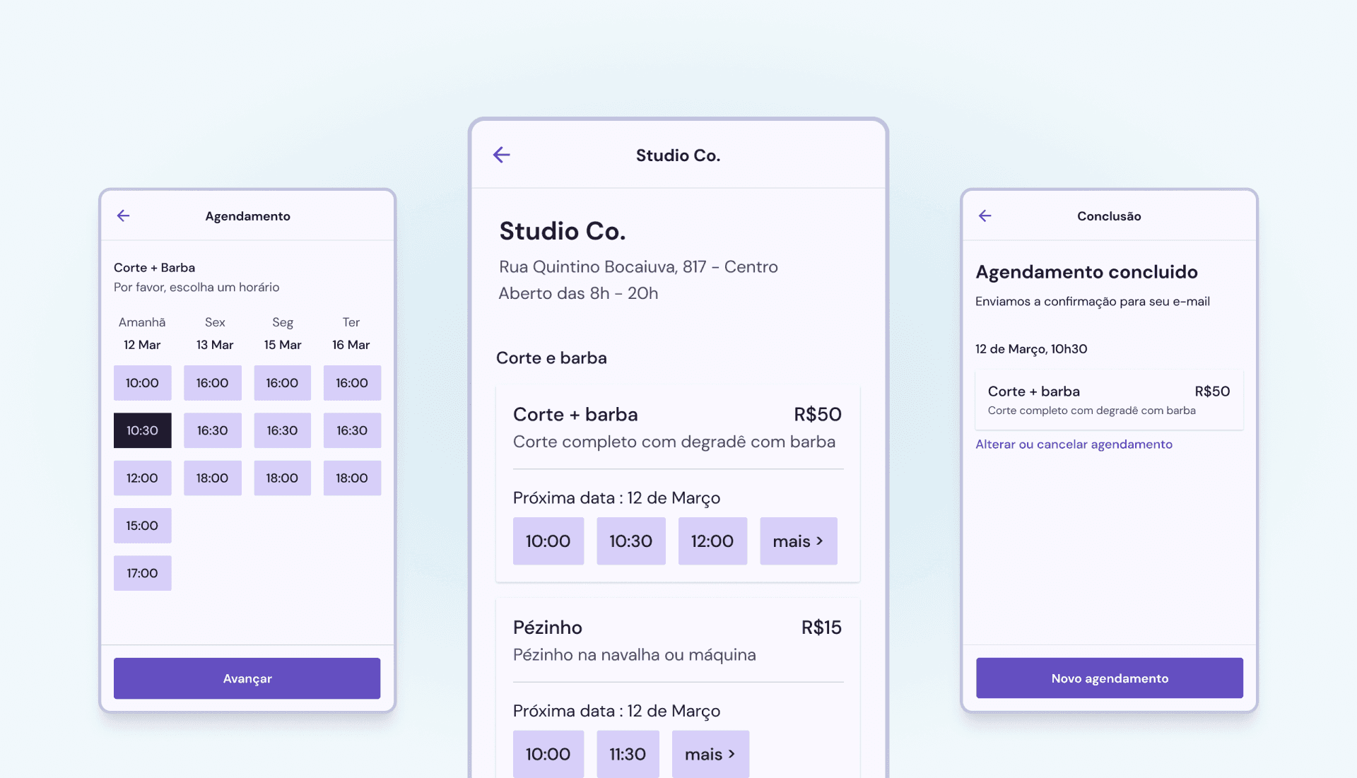
I streamlined the booking process, creating a faster and more straightforward flow. Additionally, I enhanced the user experience by providing a new booking summary screen that presents all the necessary information in one convenient location.

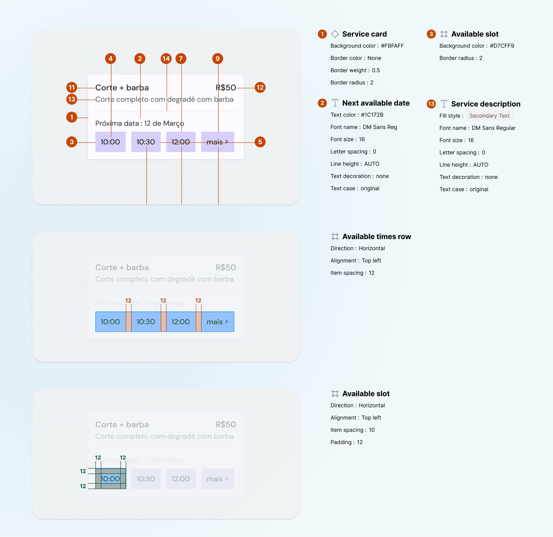
Component specification
Outcome

I expect to see a significant increase in the conversion rate and number of bookings for the app. By improving the user interface, I anticipate that more users will engage with the app and find it easier to use.The streamlined booking process is also expected to increase the number of completed bookings, as users will be less likely to abandon the process.